GRAPHIC DESIGN
Where Ideas Come to Life.
Getting your message out to the world is your goal. Ours is to make sure that it not only looks great and catches the attention of your target audience, but relays your brand appropriately to the world.
Since 2007 SandPieper Design has been working with business owners not only in Lake of the Woods, Roseau, and Koochiching County but around the country on graphic design. An attention-grabbing website coupled with alluring print materials will create a positive impression of your brand in the minds of potential customers.
From start to finish, we pride ourselves on staying ahead of the industry to create eye-popping graphics that will stand out and get your business noticed.
IMPORTANCE OF COLOR
Color makes all the difference in your marketing message and company logo. When used correctly, the right colors will attract your target demographic and go a long way toward favorably influencing his or her purchasing behavior.
In general terms, bright and bold colors are attention-grabbing but can appear brash. Muted tones convey a more sophisticated image, but run the risk of being overlooked. More specifically, particular meanings are ascribed to different colors in society…
Red implies passion, energy, boldness, and is said to stimulate hunger. For example, restaurants like McDonalds, Pizza Hut, KFC, Wendy’s and Popeyes use red in their logos to stimulate hunger.
Orange is often seen as the color of innovation and modern thinking.
Blue is one of the most widely used colors in corporate logos. It implies professionalism, serious mindedness, integrity, strength, sincerity, dependable, and calm. Blue is also associated with authority and success, and for this reason is popular with both financial institutions and government bodies.
FACTS ABOUT COLOR
93%
Color was the most important feature for 93% of consumers
when buying a new product.
80%
Color is capable of increasing brand recognition
by 80%, while also augmenting consumer confidence.
85%
85% of consumers stated color as their primary
reason for purchasing a particular product.
52%
52% of online shoppers did not return
due to a website’s overall aesthetics.
42%
42% of shoppers form their opinion on a
website based only on its design.


WHAT'S IN A LOGO?
No single element represents your business as much as your logo. Consumers need to be able to recognize and recall it from a glance.
With whatever design and color you choose, there are two essential qualities that all effective logos share. Scalability is integral; your logo will be reproduced at both small and large sizes. The ability to be printed in black and white is also important, as many advertising opportunities will only offer this format.
At SandPieper Design, we take the time to get to know you and your company to make sure the logo we create sets you in front of the competition. Our logo design services will give your business the brand foundation to grow and develop a lasting image.
TYPEFACES
What is the difference between a font and a typeface? The typeface is the name of the text style, such as Garamond or Times New Roman; the font is how that design is delivered: typeface + style + size = font. Font includes all of the other features and characteristics, such as size, bold, and italics.
Typography, or the placement of your text, can greatly advance your marketing message. It creates interest and keeps consumers engaged, which keeps them reading. It allows for the organization of thoughts and ideas, presenting them in a fashion that generates the strongest desired response.
Font choices often set the tone for the whole design and can influence viewers’ feelings toward and interactions with your design. When we combine multiple typefaces on a design, we want them to coexist comfortably — we don’t want to distract the viewer. Proper typography maximizes the opportunity your brand has to make an impression, connecting with potential consumers, and increasing the likelihood of a sale.
Serif
Serifs are the small accents on the main bodies of characters. These typefaces are often used for headlines and body copy in print mediums, but their online viability has been debated.
San-Serif
Sans-Serif fonts are named as such because they lack the serif accents. Created in the late-18th century, Sans-Serif typefaces are utilized heavily in online and digital mediums.
Script
Script fonts are adapted from the fluid, dynamic stroke of cursive handwriting. They are often light and feature long, over-exaggerated lines. They are often used to foreshadow or suggest class and elegance.
Display
Display typefaces are loosely defined as any font size 14 point or larger. These fonts are routinely employed in headlines and are often used to foreshadow the mood of a particular article or piece.
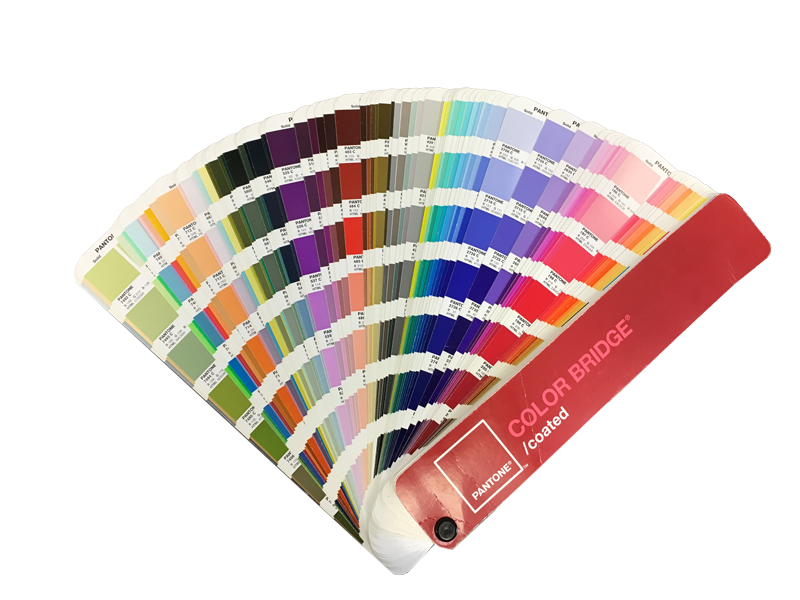
CMYK / RGB / PANTONE
When creating marketing materials, it’s important to understand the difference between CMYK and RGB. Many businesses fail to reproduce color-accurate marketing pieces due to confusing the difference between the CMYK (print) and RGB (digital) color. RGB is the best option for websites and other digital advertisements. CMYK is best for print, like business cards, brochures, and banners. At SandPieper Design we ensure that your brand identity is cohesive across your entire marketing campaign.